Visualizing Missing Data
Introduction
The first step of any data analysis is to asses your data. Typically, this assessment takes a quantitative form. One might compute summary statistics on a variety of columns: reporting information like mean, mode, or other quantiles. And yet, while such quantitative approaches can be useful, qualitative approaches also have their own merit. In particular, it is helpful to visualize the data. As the adage goes: A picture is worth a thousand words. Additionally, a visualization captures information that is otherwise lost when computing summaries.
Visualizations can be especially helpful for detecting missing data. Real-world data often contains several missing values. But often, summary statistics will just exclude missing entries from their calculations, never alerting you to the presence of missing data. And while it’s possible to calculate simple counts of the number of entries there for each variable, such tallies don’t provide any context for their results. Are certain groupings of variable correlated to go missing? Do some groups of observations all have a missing variable? These kinds of questions are best answered with a visualization.
Visualizing the Data
Getting Started
In this article I will show you how to create a simple tile plot to visualize the layout of missing data. For this demonstration, we will use the built-in iris dataset. Since, the iris dataset doesn’t contain any missing values, we’ll first need to inject some missing values into it.
data <- iris

make_missing <- function(x){
    n <- length(x)
    indices <- sample(x = 1:n, size = runif(n = 1, min = n %/% 5, max = 1.5*(n %/% 5)), replace = FALSE)
    x[indices] <- NA
    return(x)
}
data <- as.data.frame(sapply(data, make_missing, simplify = FALSE))head(iris)## Sepal.Length Sepal.Width Petal.Length Petal.Width Species
## 1 5.1 3.5 1.4 0.2 setosa
## 2 4.9 3.0 1.4 0.2 setosa
## 3 4.7 3.2 1.3 0.2 setosa
## 4 4.6 3.1 1.5 0.2 setosa
## 5 5.0 3.6 1.4 0.2 setosa
## 6 5.4 3.9 1.7 0.4 setosahead(data)## Sepal.Length Sepal.Width Petal.Length Petal.Width Species
## 1 5.1 3.5 NA 0.2 <NA>
## 2 4.9 NA 1.4 0.2 setosa
## 3 4.7 3.2 1.3 NA <NA>
## 4 4.6 3.1 1.5 0.2 <NA>
## 5 5.0 3.6 NA 0.2 setosa
## 6 5.4 3.9 1.7 NA setosaCreating the Tile Plot
A tile plot visualizes data as a 2D grid of tiles. We want our final plot to be a grid where each row is a different observation and each column is a different feature. Each cell in the grid relates to the value of a feature for the corresponding observation.
In order to create the tile plot, we’ll need to perform some transformations on the data to change it into a shape that’s compatible with ggplot. Specifically, ggplot expects all the levels for the x-axis of the plot to be in one column and all the levels for the y-axis of the plot to be another. Therefore, we need to “pivot” the data in order to get it in this format.
We can use the pivot_longer() function in the tidyr library to perform the necessary operations.
library(tidyr)

data$rowname <- rownames(data)
pivoted_data <- pivot_longer(data = data, cols = -rowname,
                             values_ptypes = list(value = character()),
                             values_transform = list(value = as.character))

head(pivoted_data)
## # A tibble: 6 x 3
## rowname name value
## <chr> <chr> <chr>
## 1 1 Sepal.Length 5.1
## 2 1 Sepal.Width 3.5
## 3 1 Petal.Length <NA>
## 4 1 Petal.Width 0.2
## 5 1 Species <NA>
## 6 2 Sepal.Length 4.9With our data transformed, we’re now ready to plot it. Below I’ve created a plot that marks a cell red if the data for that cell is missing and green if it is present. This plot provides us with a overview view of any missing entries in the data. The graphic makes it simple to identify clusters of missing features. Sometimes only a handful of observations are missing any data at all so we can just exclude them from consideration. Other times, it might be a single feature that is often missing, and we can just drop the feature.
library(ggplot2)

ggplot(data = pivoted_data) +
    geom_tile(aes(x = rowname, y = name, fill = !is.na(value))) +
    scale_fill_manual(name = NULL, values = c("FALSE" = "red", "TRUE" = "green"),
                      labels = c("FALSE"= "Missing", "TRUE"= "Present")) +
    labs(x = NULL, y = NULL) +
    theme_void() +
    theme(axis.text.x = element_text(),
          axis.text.y = element_blank(),
          axis.ticks = element_blank()) +
    coord_flip()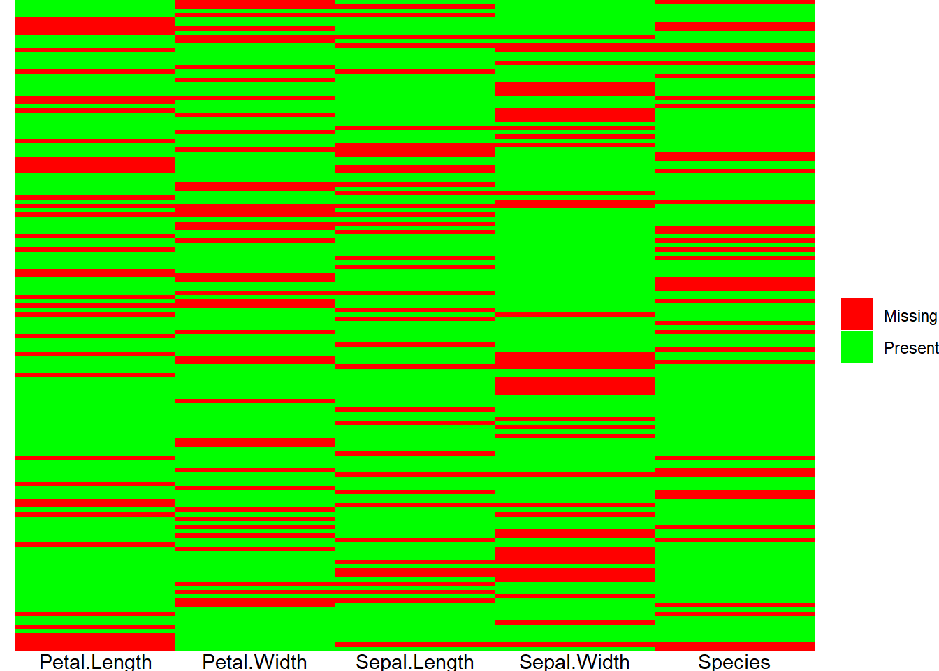
Akindele Davies
Associate Data Scientist
My research interests include statistics and solving complex problems.