Re-vision: Russian Embargo
Introduction
The other day I came across a data visualization that caught my attention. The visualization was featured in the article “Who’s Embargoing Whom?”, written by the economist Paul Krugman. The subject of the article was the ongoing war in the Ukraine. From what I could gather, the article’s main message was that both sides of the conflict, the Western Alliance and Russia, are engaged in an economic conflict with each other, in addition to the military one.
As evidence for this argument, Krugman includes a graphic - from researchers at the Yale School of Management - that shows estimated figures for Russian industrial production. Based, in part, on this graphic, he speculates, that the actions taken by the West “…appear to be hammering the Russian economy”.
Krugman speculates that the actions taken by the West “…appear to be hammering the Russian economy”.

There is a lot to admire about the graphic. The graph is a simple bar chart. There is one bar for each industry. The length of each bar is represents to the year-over-year decline in the corresponding industry.
Overall, it’s a decent visualization. Yet, the more I looked at the graphic the more I began to feel that it could be improved. I sensed that there were a couple of design changes that could make the graphic more clear and help it convey it’s point more powerfully. So let’s walk through them.
russian_industry_embargo_data <- read_csv("C:/Users/Akindele/Desktop/ThinkBox/Projects/Data Visualizations/russian_industry_embargo_data.csv")The Good
First things, first: nobody likes a critic. So, before I start criticizing, it’s only right and fair that I celebrate the graphic’s strengths.
First and foremost the graphic is readable. This can’t be overstated. At first contact, as your eyes scan the graphic, nothing jarring jumps out. The graphic does not visually overwhelm you (in a bad way). Readability is such an important quality. Research has shown that readers better understand and remember material the more “readable” it is.
One choice that improves readability is the choice to “swap” the graph’s axes. This allows the industry names to be listed vertically, instead of horizontally. Thus, the text itself runs from left to right, instead of from top to bottom. This aligns with the way that we’re accustomed to reading text.
Also, the authors did a decent job with the title and subtitle. Both help shed some light on what the graphic is about. The title is O.K., it lets us know that this is Russian Industrial Production figures and that they’re decreasing. The subtitle provides some additional details about the underlying, source data.
The Bad
Now let’s look at how the plot could be improved.
First, things first, we’ll have to recreate the graphic. Here’s my best attempt at recreating the original graphic using ggplot (technically ggplot2).1
base <- ggplot(russian_industry_embargo_data, aes(x = reorder(Category, -Value), y = Value)) +
    geom_col(aes(fill = "#00356B"), width = 0.5) +
    scale_x_discrete(position = "top") +
    scale_y_continuous(breaks = seq(0, .60, .10), labels = function(x) x * -100, trans = "reverse", expand = expansion(0, 0)) +
    scale_fill_identity() +
    labs(
        title = "Russian Domestic Industrial Production Volume Decrease by Industry",
        subtitle = "(shown as year-over-year percentage decrease - not seasonally adjusted)",
        x = NULL,
        y = NULL
    ) +
    coord_flip() +
    theme_minimal() +
    theme(
        panel.grid = element_blank(),
        axis.line = element_line(color = "grey80"),
        plot.title = element_text(face = "bold")
    )
base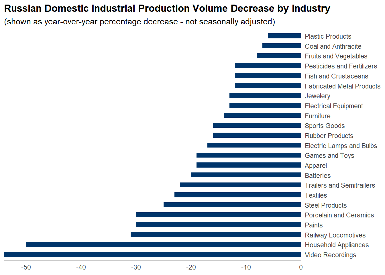
Figure 1: A recreation of the original graphic in ggplot.
The goal of any form of communication is the same: for the recipient to understand the sender’s message. When it comes to data visualization, the best way to assess how you’re doing relative to this goal is to ask yourself a few simple questions: Does this visual element help the audience understand the message? Does this element clarify and does it confuse the intended message?
To answer these questions, one first must decide what the design’s message should be. You may recall, Krugman’s main argument that the actions taken by the West “…appear to be hammering the Russian economy”. This suggests that the message should be one of loss and decline. Also, given the surrounding context of war, there are potential themes around war and battle as well.
Add Color.
The first thing that stands out to me about the graphic is it’s use of color. The only visual elements that have any are the bars. All of them are the same hue of blue.
Color is one of the most powerful elements in any visualization. It’s one of the first things our eyes notice, and therefore one of the most important parts of a design. Color is cognitively easy to process. In fact, we often notice color unconsciously, with minimal effort. Moreover, color is closely associated with many human emotions. Depending on the choice of color we can evoke feelings across the entire spectrum of human emotions.
As visualization designers it’s our responsibility to decide what message we want to convey, and which concepts, ideas, and themes to use to convey said message.
So what is the message of this work? That the actions taken by the West “…appear to be hammering the Russian economy”
Which symbols will help us convey this message?
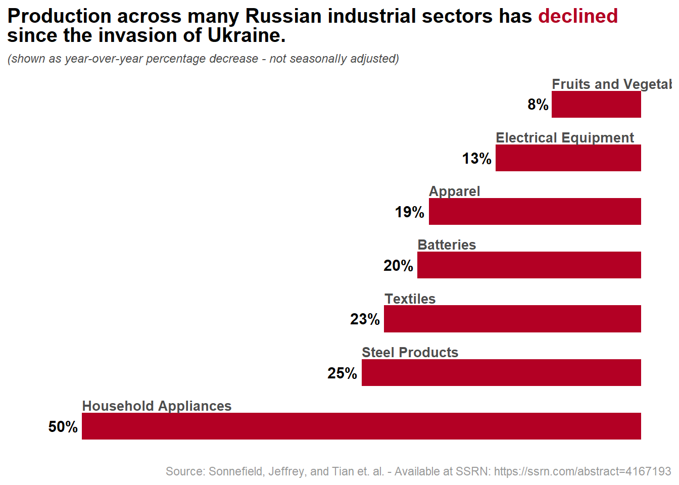
I’d argue that red is the best color to use to get this point across. Red works on many levels. First, it communicates the role of loss, decline, or of a “negative” development. Second, red naturally elicits thoughts of blood, which I think is appropriate given surrounding context of war. Lastly, there is a strong historical bases/meaning to red, as it’s featured both in the USSR flag and the flag of the Russian Federation.
bravo <- base + scale_fill_manual(values = "#B30024", guide = "none")
bravo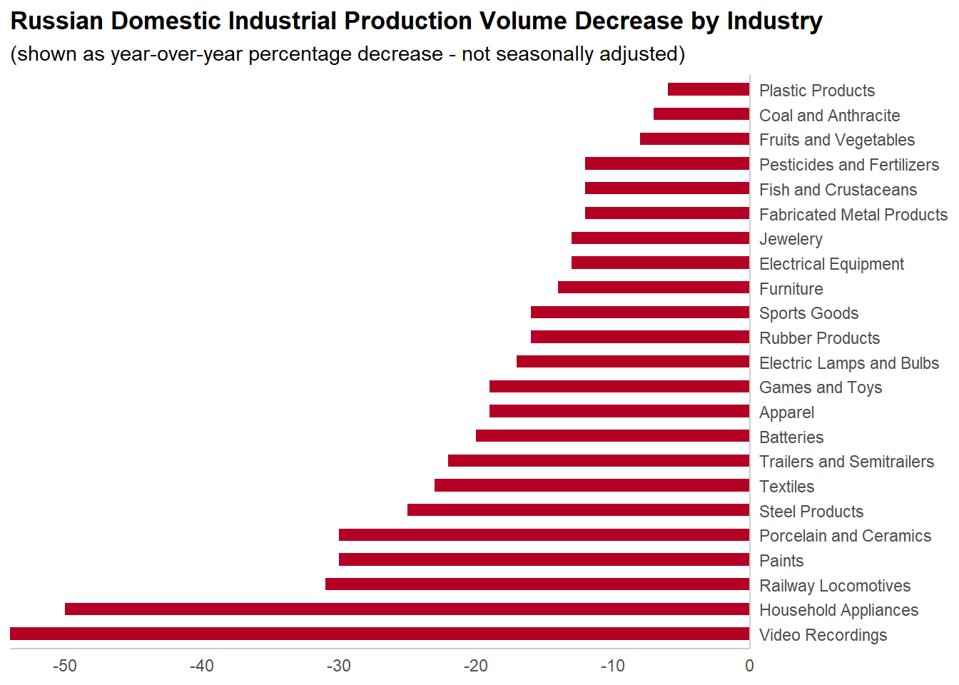
Figure 2: The choice of red color reinforces the sense of loss or decline, it’s main message.
Be Concise.
In communication, as in design, less is more. Every element that we include in a design comes at a cost. Every element that we put in front of our audience fights for their attention, and thus taxes some of their brain-energy.
In other words, clear out visual clutter.
Of course, what counts as clutter and what doesn’t is subject to interpretation. There are no hard and fast rules. That being said, there are some general principles that most of us can all agree on. We “know it when we see it”, largely just by listening to and observing our own responses as we process the graphic.
“Cross-out” the X-axis.
You may also notice that it’s hard to determine the exact value for each bar. The standard way, and the way the original visualization is configured requires the view to read the values from the height of each bar, measured by tracing an imaginary line to/from the x-axis.
In practice, it’s very hard to identify the values for each bar, especially for those bars that are further away from the x-axis. What’s more, it’s hard to distinguish absolute differences between nonadjacent bars. For example, can you easily tell the difference between Steel Products and Furniture?
One potential solution is to add gridlines to the plot at the major (every 10%) and minor (every 5%) breakpoints. This works, but it adds visual clutter to the plot. In addition, the user can still make an error while trying to follow the gridlines.
Luckily, we can address both these issues - reduce the amount of work the reader has to perform and reduce the risk of error - if we just directly label each bar.
charlie <- bravo +
    geom_text(
        aes(label = scales::percent(Value, accuracy = 1)),
        color = "black",
        hjust = 1.125,
        vjust = 0.45,
        size = 4,
        fontface = "bold"
    ) +
    scale_y_continuous(breaks = NULL, trans = "reverse") +
    theme(axis.line = element_blank())
charlie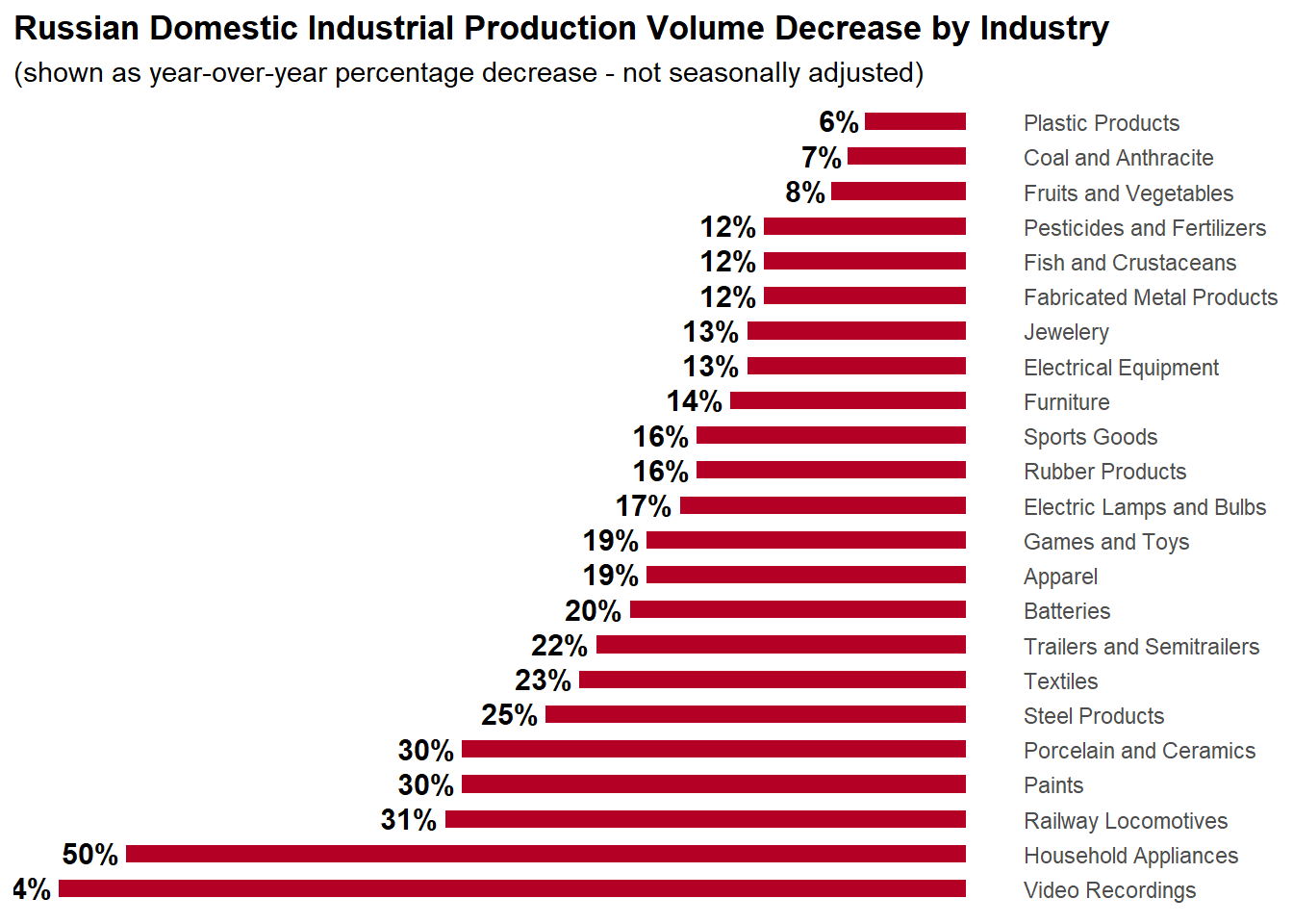
Figure 3: Pay close attention to find opportunities where you can remove visual clutter. Here, the axis lines themselves are clutter.
Less is more.
I’d argue that some of the categories themselves are clutter. Perhaps, there are only a few key industries that we should focus the bulk of our attention on. In which case, the graphic could better convey its point if we selected only a few industries to display.
delta <- charlie +
    scale_x_discrete(limits = c("Household Appliances", "Steel Products", "Textiles", "Batteries", "Apparel", "Electrical Equipment", "Fruits and Vegetables"), position = "top") +
  theme(axis.line = element_blank())
delta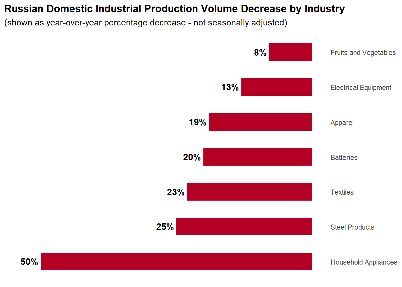
Figure 4: Narrowing down the number of categories featured focuses the graphic.
Make & Stake a Claim.
The title is your audience’s introduction to your visualization. It’s your opportunity to orient your audience as they begin to interpret the graphic. Make the most of it.
Naturally, this raises the question: What makes for a good title? Especially for a data visualization?
A couple of years ago, I was introduced to the Assertion Based presentation format pioneered by Michael Ally at Penn State. The fundamental tenet of the framework is that slide titles should clearly and directly state the conclusion the you want the audience to draw from your graphic.
All this is to say that, as a communicator, if you aren’t clear about your message, your audience will come up with their own answers, and they’ll be all over the place. As human beings, when it comes to open questions, we all have a tendency to draw our own conclusions. And each person is different, with different background experiences. By coming out and directly stating your point, you remove a lot of ambiguity. Your point isn’t left subject to interpretation.
echo <- delta +
    theme(
        plot.subtitle = element_text(color = "grey30", size = 9, face = "italic"),
        plot.title = element_text(size = 15, face = "bold")
    )  +
    labs(
      title = str_wrap("Production across many Russian industrial sectors has declined since the invasion of Ukraine.")
    )
echo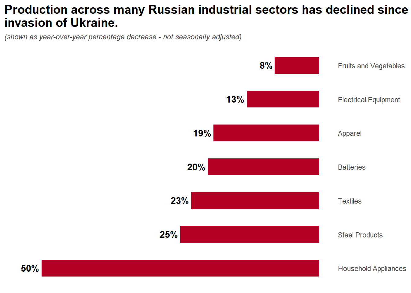
Figure 5: Come out directly and state your point.
Finishing Touches
Now this is a bunch of small touches that really take the graphic to the next level. First, I got rid of the axes labels, and moved them directly onto each bar. This helped consolidate the graphic.
selected_industries <- c("Household Appliances", "Steel Products", "Textiles", "Batteries", "Apparel", "Electrical Equipment", "Fruits and Vegetables")

labels <- selected_industries
labels[7] <- str_wrap(labels[7], 7)
echo +
    scale_x_discrete(limits = selected_industries, position = "top", breaks = NULL) +
    geom_text(aes(label = Category), fontface = "bold", size = 3.5, vjust = -1.5, hjust = 0, color = "grey30") +
    labs(
        title = "Production across many Russian industrial sectors has <b style='color:#B30024'>declined</b>
        since the invasion of Ukraine.",
        caption = "Source: Sonnefield, Jeffrey, and Tian et. al. - Available at SSRN: https://ssrn.com/abstract=4167193"
    ) +
    theme(
        plot.title = element_markdown(face = "bold"),
        plot.caption = element_text(color = "grey60"),
        # plot.margin = margin(r = 80),
        axis.line = element_blank()
    )
Seeing the graphic this way, I realized that now that we had fewer cateogries, we could undo a decision from the original graphic as “swap” the axes back. This re-positions the bars so that the run vertically. In my view, this is an improvement that echoes the physical sense of decline as a fall , or vertical movement. Together with the scarlet red color it even conjures the idea of dripping blood. An apt reference for a graphic about war.
# c("Appliances", "Steel", "Textiles", "Batteries", "Apparel", "Electrical Equipment", "Fruits & Vegetables")
foo <- echo +
    scale_x_discrete(limits = c("Household Appliances", "Steel Products", "Textiles", "Batteries", "Apparel", "Electrical Equipment", "Fruits and Vegetables"), position = "top", labels = function(x) str_wrap(x, 15), expand = expansion(add = c(0.3, 0.6))) +
    # geom_text(aes(label = Category), fontface = "bold", size = 3.5, vjust = -1.2, hjust = 0, color = "grey30") +
    labs(
        title = "Production across many Russian industrial sectors has <b style='color:#B30024'>declined</b>
        since the invasion of Ukraine.",
        caption = "Source: Sonnefield, Jeffrey, and Tian et. al. - Available at SSRN: https://ssrn.com/abstract=4167193"
    ) +
    theme(
        plot.title = element_markdown(face = "bold"),
        plot.caption = element_text(color = "grey60"),
        axis.line.x.top = element_line(color = "grey60"),
        axis.text.x = element_text(face = "bold"),
    ) +
    coord_cartesian() +
    geom_text(
      aes(label = scales::percent(Value, accuracy = 1)),
      color = "white",
      hjust = "center",
      vjust = -0.2,
      size = 4,
      fontface = "bold"
    )
foo$layers[2] <- NULL
foo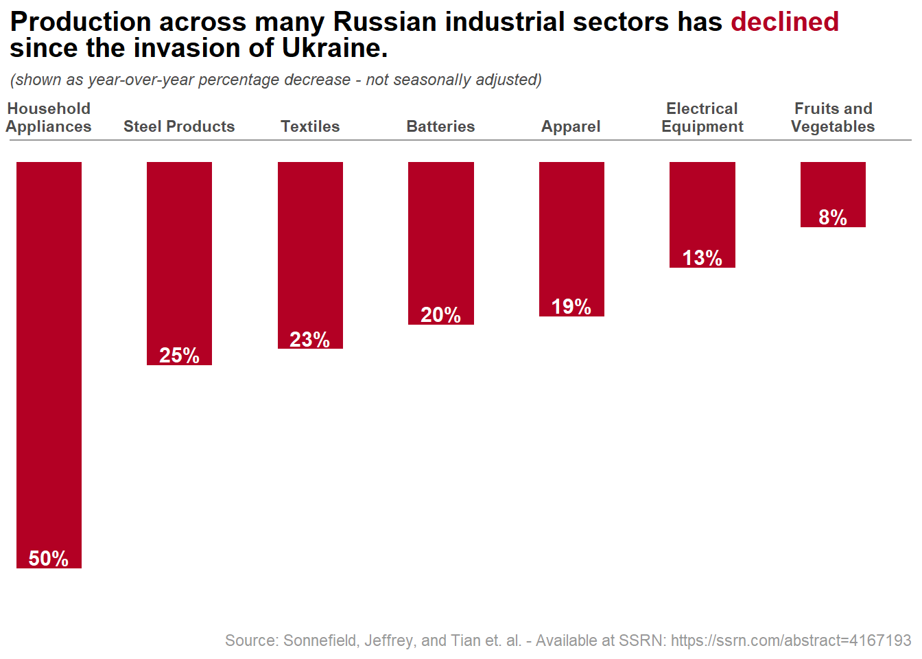
Data values are not exact. I tried my best at “guestimating” the values from the original graphic.↩︎
Akindele Davies
Associate Data Scientist
My research interests include statistics and solving complex problems.