Raising The Bar: Designing Better Bar Charts
Introduction
What is a Bar Chart?

How can I create a Bar Chart?
GGplot is my preferred data visualization library, so it’s what I’ll use throughout the series. Within ggplot there are two function that you would usually
use to create bar charts: geom_bar() and geom_col(). The key difference between the two functions is that geom_bar() performs some computations on the input data before it renders the visualization, whereas geom_col expects the user to perform any summarization beforehand.
data_summary <- apply(iris[, -c(5)], 2 , mean, na.rm = T)
data <- do.call(data.frame, as.list(data_summary))
data <- gather(data, "attribute")
Also for this demo we’ll use the iris dataset that’s built into R. “The famous (Fisher’s or Anderson’s) iris data set gives the measurements in centimeters of the variables sepal length and width and petal length and width, respectively, for 50 flowers from each of 3 species of iris. The species are Iris setosa, versicolor, and virginica.” We’ll simply process the data to compute the average value for each variable: sepal length and width and petal length and width.
For this demo, we’ll use geom_col(). geom_col() expects two aesthetics: x, describes the different groups/bars in the graph; and y, the magnitude(/height/length) for each bar. In our example, the x aesthetic corresponds to the aqttribute column and the y aesthetic corresponds to the value column.
base_plot <- ggplot(data, aes(fill = attribute)) +
    geom_col(aes(x = attribute, y = value))

base_plot +
    labs(
        title = "A Basic Bar Chart of 'iris' attributes",
        x = NULL,
        y = "Value (cm)") +
    theme_minimal() +
    theme(legend.position = "none")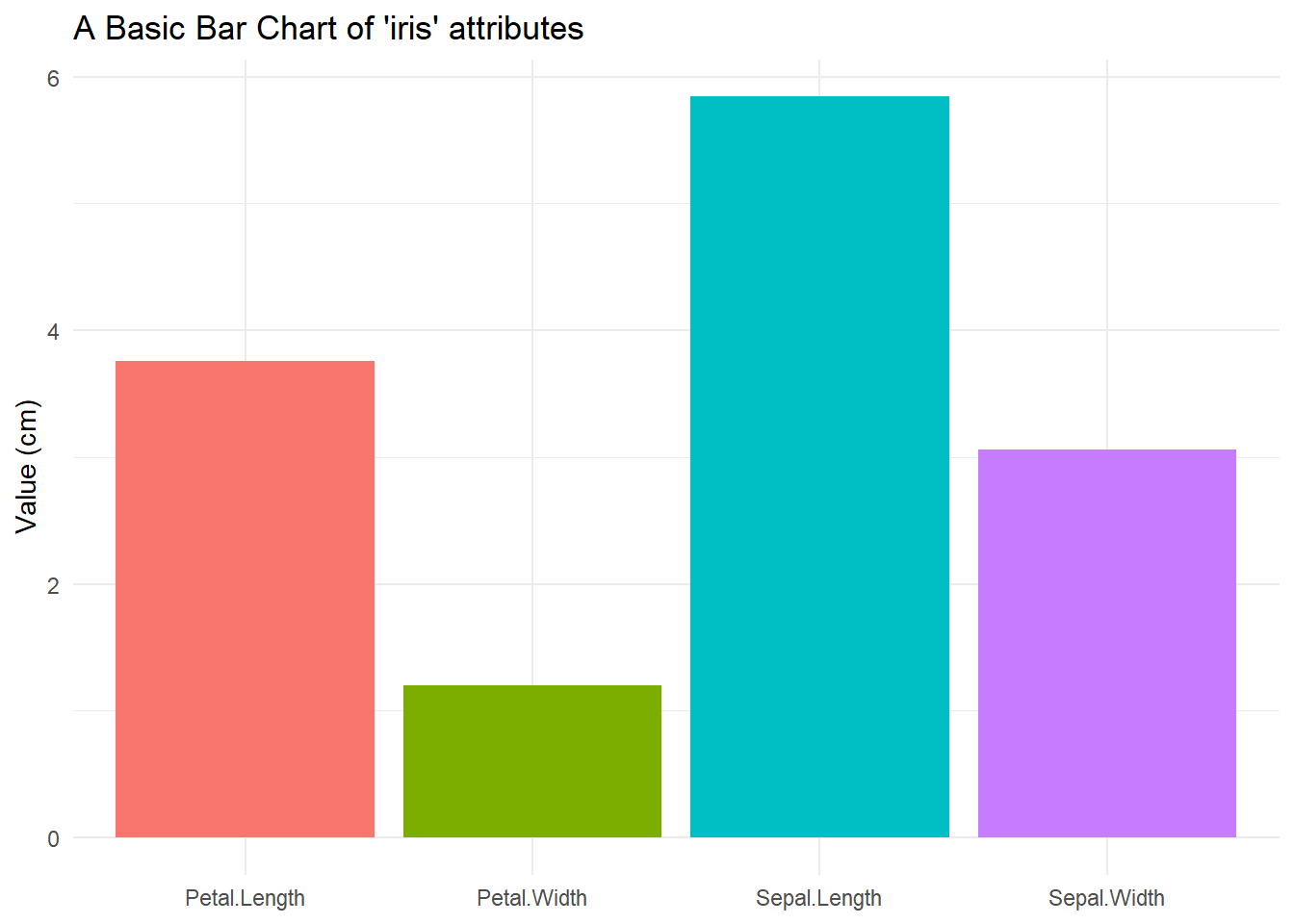
Conclusion
That’s it for now. In the next installment we’ll start dive into some of the design principle that you should consider when designing or evaluating bar charts. First up: How does the choice of baseline impact a graph?
Akindele Davies
Associate Data Scientist
My research interests include statistics and solving complex problems.